Ivy Ross doesn’t enjoy the same name recognition or cachet as Apple’s Chief Design Officer, Jonathan Ive. But one could strongly argue Ross – not her Cupertino counterpart – is more likely to be remembered as the more influential figure in shaping human interaction with cloud-enhanced technologies as the digital landscape veers toward voice-activated interactivity. As Head of Design for Google Hardware, Ross spearheads the tech giant’s charge into consumer products, injecting the world’s most powerful information technology company with a shot of tactility and emotion identifiably warmer and more human than ever before, yet still undeniably “Googley”.

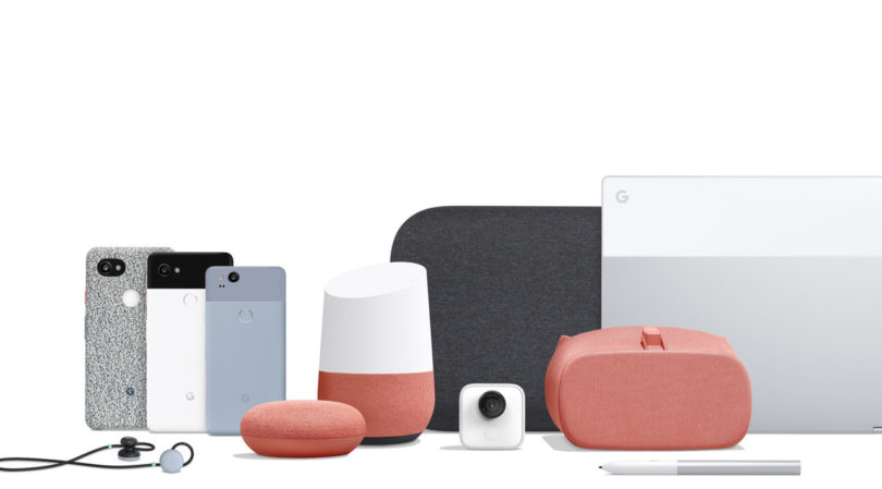
This past autumn Google announced a cohesive collection of 8 home and mobile devices: the Pixel 2 and 2 XL, the AI-enhanced Google Clips camera, a new Daydream VR headset, the stone-shaped Home Mini and its larger wireless speaker sibling the Max, wireless Google Assistant connected Pixel Buds headphones, and the Pixelbook laptop.
The perpetual exploration of online technologies and cloud services continues to percolate from Mountain View, but it’s under Ross’s guidance the company’s hardware has finally calcified a family of products with a cohesive aesthetic and tactile style. Warm(er) and friendly(ier), this new Google wants a literal place in your home, with designs representing this intention. Just as the company’s search page presents users with a minimalistic point of entry, embellished only by the company’s multicolored logo (or Google Doodles), the latest family of consumer products represents a similar physical manifestation of a friendly entrypoint – products delivering the same interactive simplicity with an undercurrent of playfulness that has defined Google’s search identity.
Credit the multi-dimensional Ross for bringing an ebullient and passionate perspective serving an optimistic belief in design, one formed zig-zagging across various industries and companies, including Art.com, Gap, Disney Stores North America, Mattel, Calvin Klein, Coach, Liz Claiborne, Swatch Watch and Avon. It seems almost ironic someone with a career so varied turns out to be the deliverer of a cohesive design message – a second generation of consumer hardware products all merging toward a point of commonality previously unseen in previous iterations of Google products.
Ross spoke to us about what exactly makes this generation of Google consumer product still identifiably Google, but ever more accessible.
Google has established itself as an data technologies and app driven company, but it finally seems Google is focused on establishing its own identity in hardware. How would you characterize this newfound identity?
Human, optimistic, and bold. Google now has a fun element to it. Our optimism shows through with touches of colored buttons and little details we’ve added throughout to surprise. I think “bold” is also very much part of Google’s culture. We’re permitted moonshots, trying things and going for it.
What’s most noticeable now is a continuity that wasn’t apparent before, a visual and material language connecting the gap between technology and object.
I think as a design line we want to keep things simple, but tried to incorporate more than one material within every product. For example, the Pixel 2 phone can be partnered with some beautiful fabric cases.
The fabric covered cases definitely deliver a confident grip. But the Pixel 2 XL is also very pleasurable to hold sans case; the exterior isn’t so slick that it’s slippery like some phones.
My boss Rick and I both have the Panda, the black and white version of the Pixel 2 XL. One day during a meeting we both took our phones out and I made a remark about his phone without a case.
“You can’t cover it. It’s too beautiful.”
Feel overcame fear.
I love that. Well, if mine breaks, I know where I can get a new one [laughing].
Much attention was given to the new Pixel 2’s polyester and nylon knit phone cases, two paired with contrasting buttons and interiors.
Could you give an example of “trying things and going for it”?
I don’t know if you have….you probably don’t have it yet…do you have the Biggie? Biggie – the Google Home Max – can be oriented horizontally or vertically. Usually you have to put these ugly little feet and commit to its primary location in one way versus another. But instead we’ve designed this beautiful silicone, rubber magnetic tab that you can just slap on either the bottom for both vertical or horizontal orientation.

The Google Home Max multi-room speaker is draped in acoustically transparent fabric designed to complement sound and interior decor. It can be positioned both horizontally or vertically, and two can be paired for stereo playback.
So the user chooses according to their needs, rather than the speaker dictating its placement…
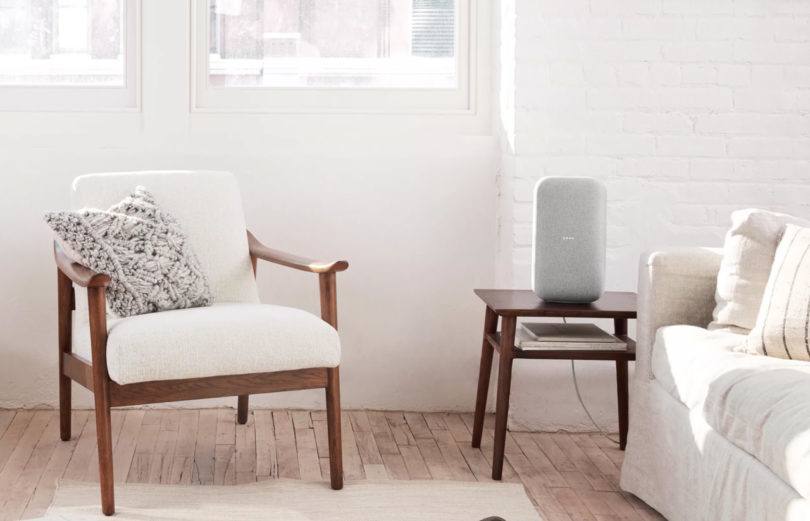
Yes, we’re very much about making sure the technology fits into your life and doesn’t stand out. Technology is here to stay, so it needs to disappear or fit in with your environment. The days of the big black boom box are gone, so that’s why we used soft knit and picked specific colors.
I read the fabric for the Home Mini wasn’t chosen just as an expression of aesthetics, but in service of acoustics. But I noticed while the Daydream View headset is covered in similarly hued fabric, it was not exactly the same. Can you elaborate about the purpose of these differences?
We will never sacrifice function for aesthetics. And I don’t believe we have to be matchy-matchy. The designs are united by color, but also separated subtly by different criteria reflective of use. For example, comparing the Daydream to the Home Mini: the wearable has to be durable and keep light out, while the speaker has to permit light to show through the fabric and be acoustically appropriate. We picked fabrics accordingly. This is an example where we were challenged to serve function through form, serving each individual product while finding a way to unite them.

The fabric covering the new Google Daydream View offers wearers a soft VR headset experience intended to work with Pixel 2 and Pixel XL 2.
My team and I believe in the tension of opposites. Because it’s not “either/or”. It’s “and/both”.
I’ve been reading Janine Benyus’s book, Biomimicry: Innovation Inspired By Nature and I was left wondering whether the colors chosen by you and your team – Chalk, Fog, Coral, Charcoal – were the conclusion of trend research, or formulated using data connecting objects with our biological and evolutionary connection to certain natural objects? Does that seem too far out or a reach?
No, no…that’s a really great question. My team and I believe in the tension of opposites. Because it’s not “either/or”. It’s “and/both”.
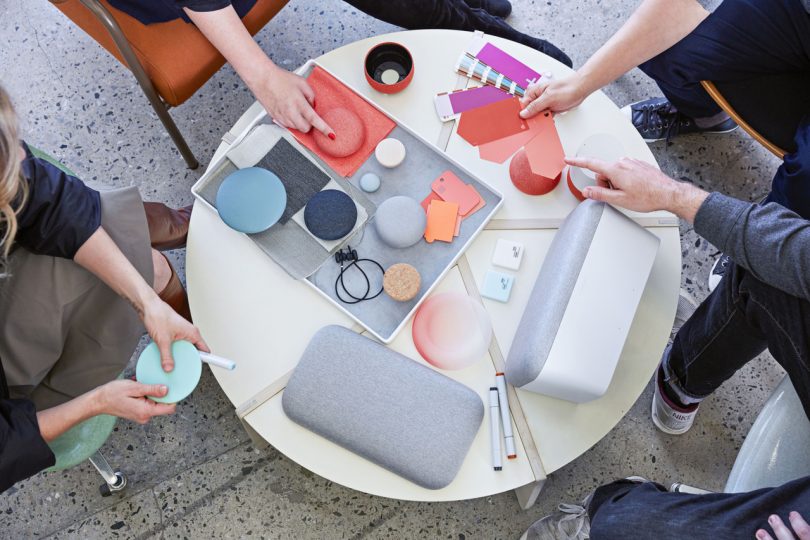
We may have tried 98 different shades of white. And as a technology company, at first Google was like, “What? Why do you have to try making 98 color samples or 127 samples of gray?” But those subtle details make all the difference. It may not register consciously if someone isn’t naturally attuned to the details of design, and they may not be able to articulate those feelings – but colors have different vibrations in combination. We really spend a lot of time on that.
One of the most enjoyable details was small and hidden: the splash of coral [orange] gracing the underside of the otherwise gray Home Mini. It reminded me of turning a fallen leaf over to find a colorful fungus growing on its underside or the inside of a seashell. It didn’t seem necessary, but it was certainly a delightful detail.
You’re my model poster child! Because everything you’re saying is what we literally had to spend so much time defending. “Well, why does it matter if it’s underneath?” Oh. My. God.
The objective was to surprise and delight. It’s surprising turning over a gray or white speaker over and finding a pop of color. We didn’t want to expose the orange on the surface, but keep it as an optimistic opportunity for discovery.
Google has priced these products rather affordably, making smart home and even the VR experience, available to all. A lot of emerging technology is priced out of reach, and only the mobile phone seems to have reached that ubiquitous state where everyone, everywhere seems to use one. What’s Google strategy for serving people beyond the traditional affluent demographic and inviting everyone through the door?
Give us some time. We’ve just begun. All I can say is that if any brand has their eyes on accomplishing this goal, and can do it, I think it’s Google. But this is a huge step for us to just be in the hardware business across this range of products and categories.
But you’re right. It’s important, and we believe that everybody who Googles…everybody should have access to radically helpful technology that’s beautiful, and it’s on our radar for sure.
from Design MilkDesign Milk https://design-milk.com/how-ivy-ross-helped-change-google-design/
from Home Improvment http://notelocreesnitu.tumblr.com/post/169817389854


No comments:
Post a Comment