Sunday 30 September 2018

6 Ways to Decorate With Witches This Halloween

With Halloween coming up, you may be wondering how to get that spooky vibe for the season. A go-to accessory for Halloween is, of course, witches. From tabletop dolls of cute, small child witches to ugly hags on the front lawn to those goofy flat hangings that make it look like a witch flew into your house, witches are completely synonymous with Halloween decor. So to get a perfect Halloween home, why not incorporate a witch or two? Below we’ll cover several fun ways to decorate with witches in your home this Halloween.

Decorate with Witches Flying Figure

Place a witch on a banister to make it look like she’s flying through the room. Image: Mackle Construction Co.

Fun placement

Perhaps one of the most enjoyable aspects of using a witch in your Halloween decor is the fun of finding places to put her. Since fantasy witches tend to fly on brooms, they can go just about anywhere. The photo above shows how placing a witch on the banister of a staircase makes it look like she’s flying through the home.

You might also consider hanging flying witches from the ceiling using clear wire. You could place a flat witch decoration high on the wall. Outdoors, you could have a flying witch hanging from a tree. Feel free to get creative with where you place your witches on broomsticks.

Decorate with Witches Entryway Figure

A witch at your entryway is a great way to greet trick-or-treaters. Image: Mary Prince

Realistic front door props

Another good way to decorate with witches is to place them right by the entryway of the home, as the photo above shows. It makes it look like the witch is either welcoming people or chasing them away, depending on how friendly or scary she looks.

The figure in the photo above also has a strong fairy tale vibe, since she’s holding out what looks like a poisonous red apple that she’s about to offer Snow White. It shows that you can get creative with little additions. Adding a faux red apple to any decor witch’s hand gives an instant fantasy feel.

Decorate with Witches Pumpkin Design

You can go more subtle and conceptual by just displaying a witch’s hat. Image: Tina M. Yotka Container Gardens

Subtle hints

You also don’t have to go completely literal with your witch decor by finding realistic figures. You could subtly get a Halloween feel by incorporating items that hint at witchery, like the witch hat that sits on top of the cornucopia in the photo above. It’s a more subtle look if you’re not into the old hag or unrealistic fantasy side of witches.

And combining a witch hat with a cornucopia makes it a more versatile, all-purpose fall décor item that works from September all the way to Thanksgiving. It’s also a great way to get deep, bright hues into a space, thanks to the red foliage and orange pumpkins.

Decorate with Witches Mantel Design

If you have one, remember your mantel for setting the Halloween tone. Image: Sarah Greenman

Witch mantel

Mantels are a great place for incorporating seasonal décor. Because it’s the natural focal point of the room, it’s a good place to set the mood for the season.

In the photo above, notice the two witches on either side of the TV. One of the rules for decorating a mantel is to create symmetry between both sides, and the two green witch dolls are a creative take on that rule. It’s also a subtle, affordable way to decorate with witches, as some of the larger figures can run pretty pricey if you’re on a budget.

Decorate with Witches Skeleton Style

Combine a skeleton with witch accessories for a look that has double the Halloween spookiness. Image: Sarah Greenman

Skeletal touches

While witches are synonymous with Halloween, so are skeletons. This clever design manages to combine the two for a unique, creative way to decorate with witches. To reiterate one of the points above, it also shows how fixing a witch on a broom to a wall higher up can make it look like she is flying through the room.

You could find a skeleton figure and dress it up in a witch dress and hat, then hang it from the ceiling or a tree outdoors. And that’s just for starters. This is another idea that begs for your creative input.

Decorate with Witches Group Design

Get fully immersed in the fantasy feel with a coven of glowing witches. Image: Grandin Road

Create a scene

Ever wish your yard could look like something out of Hocus Pocus? These witch figures will make it look like your yard is bringing magic to life. The witches pictured above are actually a set of three from Grandin Road, so if you want a larger coven of them you’ll need two or three sets. But three holding hands can work, too.

They work well placed around glowing pumpkins, like in the photo above. You could also purchase a more traditional cauldron. Or you could just have them standing in a circle or semi-circle. The glowing heads and all-black dresses will make them look fantastical and spooky, no matter what you do with them.

What are some of your favorite ways to decorate with witches come Halloween? We’d love to hear about them below!

The post 6 Ways to Decorate With Witches This Halloween appeared first on Freshome.com.


from Freshome.com - Interior Design & Architecture Magazine https://freshome.com/decorate-with-witches-this-halloween/

from Home Improvment http://notelocreesnitu.tumblr.com/post/178600018424

Saturday 29 September 2018

7 Ways to Stick to Your New Build Budget

Making the decision to build instead of buying a home is the easy part. After that, the real work starts. Working with your builder to choose plans, finishes and overall budget can test your limits, but it’ll ultimately get you exactly what you want. Of course, what makes sense on paper doesn’t always work when it’s time to break ground. Unplanned setbacks, sudden changes and fluctuations in the building market can derail even the best-laid new build budget.

If sticking to your new build budget is a concern, start planning before you ever spend a dime. A little creative budgeting and a lot of foresight ensures that you’re able to build your home without ending up in the poorhouse. Here’s how.

new build budget inventory

Take stock of your major items to start. Image: Wyrick Residential Design

1. Start by categorizing

One of the easiest ways to blow a budget is by simply failing to plan. Your contractor will assist you in working out your numbers, but educating yourself helps you stay in the ballpark. Start by creating categories of the biggest costs, like land costs, exterior costs and interior costs. Then use a spreadsheet to track the various subcategories for each heading. This helps you identify costs that may have slipped your mind (don’t forget the price of moving!) and understand the bulk price for each major category.

2. Create a contingency fund

Never in the history of homes has a build been completed exactly as planned for exactly the amount planned. Speedbumps along the way slow you down and may also be expensive. Whether it’s an unforeseen land issue, bad weather or a change to some of your original finishes, time is money. Always keep a contingency fund for the things you couldn’t have planned for. A good rule of thumb is to multiply the budget your contractor gives you by 1.5, keeping the excess available so you have a safety net throughout the build.

new build budget scope creep

The little extras can add up. Image: Artisan Home Tour

3. Stop scope creep

A couple hundred dollars here or there might not seem like a big deal, but scope creep can completely blow your budget. Scope creep refers to small, incremental spending that drives up the overall cost of your build. It’s when you opt for nicer finishes without plugging the new cost into your budget or authorize your builder to spend a little more on paint than you’d planned. Once you have your budget set, stick to it.

4. Choose to splurge

There’s nothing wrong with a few pricey features in your home. But making a conscious choice to splurge on select treatments or rooms in your home means budgeting for them ahead of time. When you allow yourself to upgrade the important stuff, being more budget-friendly in other areas is more manageable. What’s more, a few personal splurges makes you feel more satisfied when it’s time to move into your new home.

5. Opt for functionality first

When choosing where to budget your money, make sure to adopt a “functionality first” mindset. Spending more on a high-quality water heater, for example, might not seem all that exciting, but it’s an investment in the future of your home. Remember that aesthetics change, but the quality behind your walls will always matter. You can always repaint your living room or swap out your cabinet hardware, but a cheap furnace can cause you years of expensive repairs.

new build budget track

Keep careful track of every cent in your new build budget. Image: Studio M Interiors

6. Track your new build budget

A budget is a lot like a diet: Sometimes, you don’t even realize that you’re blowing it. Tracking your spending is the best way to identify areas where you can improve and where you might be spending too much. If you’re old-school, a paper planner or notebook is an easy way to jot down purchased items. Or download an expense tracking app on your smartphone and upload your receipts.

7. Add sweat equity

When push comes to shove, the best investment you make in your home is your own sweat and tears. Sweat equity is smart because it saves on labor costs and construction management premiums. While you should definitely leave the complicated stuff to the pros, getting a little paint on your clothes can help if you’ve overspent in other areas. Focus on your strengths and put some of your own work into the process and you’ll save big on your final price tag.

Keeping your new build budget low doesn’t have to be a strain, but good planning will reduce some of the stress. If you feel like you’re veering off-budget, some restraint and a few adjustments can help get you back on track. Just remember that you’ll be paying for your home for years to come, so the choices you make now will definitely affect the way you feel about your new place later. Careful categorization and good communication with your builder means you’ll love the end result.

Do you have any other tips for sticking to a new build budget? We’d love for you to share your experiences below.

The post 7 Ways to Stick to Your New Build Budget appeared first on Freshome.com.


from Freshome.com - Interior Design & Architecture Magazine https://freshome.com/stick-to-your-new-build-budget/

from Home Improvment http://notelocreesnitu.tumblr.com/post/178569071664

Friday 28 September 2018

Your Ultimate Guide to Paint Finishes: What Type Is Best for Your Walls?

When working with paint, the finish you choose is almost as important as the color. Sheen has a direct impact on how a shade looks, how easy it is to clean and how well it hides imperfections on your walls. With that in mind, it’s crucial to know your options for paint finishes before you get started. Read on to get a sense of the different paint finishes that are available, as well as how to use them.

paint finishes matte

A matte finish is the most common type for interior walls. Image: Martha O’Hara Interiors

Matte paint

Matte paint — sometimes also called flat paint — is the most common choice for interior walls and ceilings. It’s popular because it offers little to no shine, letting your other design choices have the focus. A matte finish goes well in just about any room in your home.

Another benefit of matte paint is that it is very good at hiding imperfections like chips or cracks in the walls. For this reason, it’s particularly well-suited for use in older homes, which may have experienced wear and tear over time. On the other hand, the flatness of this paint makes it very hard to clean off handprints and other marks. In fact, it’s often easier just to touch up with another spot of paint, so make sure to keep some on hand if you decide to go this route.

paint finishes matte enamel

Matte-enamel paint has a matte finish but is much more durable than normal matte paint finishes. Image: Fisher & Paykel

Matte-enamel paint

As the name suggests, matte-enamel paint is very similar to matte. Just like the option above, it comes with a flat finish and little-to-no shine. However, this finish comes with one more added benefit. The chemical makeup of matte-enamel paint has been altered slightly so that a bit of film forms on the surface as it dries, making it easier to clean.

The extra durability of matte-enamel paint makes it an especially good fit for high-traffic areas like kitchens and bathrooms. If you’re looking for these paints at a local home improvement store, they will most likely be labeled as “washable,” owing to the fact that they’ll stand up to a light scrubbing with mild soap and water.

paint finishes satin

Eggshell paint is a midpoint between a matte and a gloss. Image: RS Myers Company

Eggshell paint

Now we start to get into some shine. If you can picture the slight sheen on the outside of an eggshell, you have a pretty good idea of what eggshell paint is going to look like. This type of finish is great for busy family homes because the surface is very easy to clean. Yet, you don’t have to contend with the eye-catching luster that comes with some of the glossier finishes.

If this paint has one downside, it’s that the finish begins to show cracks and other imperfections in the wall over time. Make sure you patch up your walls before using this type of paint. Additionally, always work your brush in the same direction to avoid creating lines as the paint dries.

paint finishes eggshell

Satin paints have a more of a shine to them than eggshell finishes. Image: Hilderbrand Interiors

Satin paint

The next step up from eggshell, stain paint is well-liked because it gives off a warm, almost velvety feel once it’s applied. It’s a particularly good choice for framing elements like doorways, trim and moldings. However, its durability also makes it a good choice for high-traffic areas like hallways, kitchens and bathrooms.

The upside to a satin finish is that it is very easy to clean and it resists chipping and peeling fairly well. The downside is that it’s often possible to see individual brushstrokes. In this case, touch-up painting is no longer an option.

paint finishes semi-gloss

Semi-gloss paint is great for trim work. Image: Jerry Jacobs Design, Inc.

Semi-gloss paint

Semi-gloss paint is similar to satin. However, the extra sheen guarantees that more light bounces off, making the shade you choose appear darker than it would with a satin finish.

Again, semi-gloss finishes are a good choice for any rooms with walls that need to be frequently cleaned (heads up, parents with kids who like to draw on the walls). The shine of semi-gloss also makes it a perfect fit for any individual design elements that you want to emphasize. Consider using it for things like kitchen cabinets, fireplace mantels or banisters.

paint finishes gloss

Use gloss paint to make a style statement. Image: Archer & Buchanan Architecture, Ltd.

Gloss paint

Finally, we have gloss (also known as high-gloss) paint. The shiny, reflective surface of this paint makes it a good choice for window and door trim or furniture. However, if you want to really bring a glamorous aesthetic into your interiors, don’t be afraid to go big and put a coat or two on your walls.

Which paint finishes do you prefer in your home? Do you have any tips on how to apply them correctly? Let us know in the comments.

The post Your Ultimate Guide to Paint Finishes: What Type Is Best for Your Walls? appeared first on Freshome.com.


from Freshome.com - Interior Design & Architecture Magazine https://freshome.com/paint-finishes/

from Home Improvment http://notelocreesnitu.tumblr.com/post/178545774639

Honey Catches More Flies Than Vinegar… or Does It?!

Honey Catches More Flies Than Vinegar… or Does It?!

We’ve been obsessed with incorporating interactivity in our plated courses for years by using recognizable utensils in unconventional ways. When given the task to create a honey-based dessert around the honey dipper… Pinch Food Design’s pastry chef Tori Fusaro came up with a spectacular combination of flavors and textures to wow both the eyes and tastebuds! Below are the recipes… it BEE-hooves you to try them!

Serves 4-8

Marscapone Mousse
375g of mascarpone
160g of cream cheese, Philadelphia
150g of crème fraîche
100g of caster sugar
1 vanilla pod, seeds scraped
2 oranges, juice and zest
2 lemons, juice and zest
60ml of Grand Marnier
3 gelatin leaves

Directions:
To prepare the mascarpone mousse, add all of the ingredients (except the Grand Marnier and gelatin) to a food processor and start blending. Slowly add the Grand Marnier until incorporated. Bloom the gelatin in cold water, then add to a dry pan and melt over a low heat. Add to the blender and blitz to incorporate. Once the mascarpone mixture is smooth, pass through a sieve into a tray (16 x 24 x 2cm) and leave to set in the fridge for at least 2 hours. Portion into rectangles approximately 2cm x 10cm and refrigerate until ready to serve.

Honeycomb Crumble
221g sugar
13g water
25g corn syrup
1 ¾ teaspoon baking soda

Directions:
Combine all the ingredients except baking soda. Boil to 300 degrees F. Remove from heat and whisk in baking soda. Pour into a greased pan. Let cool for 1 hour. Crumble.

Frozen Honeycomb-Molded Shortbread Glaze
180g all purpose flour
110g almond flour
110g butter, cold
90g confectioners sugar
2g salt
50g grapeseed oil

Directions:
Preheat the oven to 325 degrees F. Line a baking sheet with parchment paper. Using a stand mixer, paddle both flours, butter, confectioners’ sugar, and salt on low speed until the dough forms a crumbly texture. Transfer to baking sheet and bake until golden brown, about 25 minutes, stirring every 10 minutes to evenly brown the shortbread. Let cool at room temperature. Transfer the mixture to a food processor and pulse to a fine crumble. Transfer the crumble to a blender and blend in the oil on low speed. Once fully incorporated, puree on high until the shortbread becomes liquified. Pour liquid into honeycomb mold and freeze.

Vinegar Honey Drizzle
1 cup honey
2 tablespoons Apple Cider Vinegar

Plating Instructions:
First lay the marscapone mousse portion on plate.
Then add frozen honeycomb-molded shortbread glaze on top of the mousse.
Add the honeycomb crumble on either side of the mousse.
Garnish with bee pollen.
Lastly, drizzle the vinegar honey on top using a honey dipper.


from Design MilkDesign Milk https://design-milk.com/honey-catches-more-flies-than-vinegar-or-does-it/

from Home Improvment http://notelocreesnitu.tumblr.com/post/178545756504

Crispy Baked Rice Layered with Chicken + Giveaway

When I was in my very early teens, my summer job for several years was to help out around my father’s architectural studio. I answered phones, made blueprints, figured out how to use workable fixatif to make postage stamps reusable (not that I actually reused any, because that would be a felony), and learned some Farsi. There were two Persian architects who also worked in the studio, Kathy and Mohsen. I was intrigued by their Post-It notes written in Farsi. Noticing my curiosity, they bought me a Farsi reader, taught me the alphabet and the first few pages, and I was off on my own.

This summer, when Naz Deravian reached out to me about her first cookbook, Bottom of the Pot: Persian Recipes and Stories, I told her how happy I was to see a new book about Persian food. After a few emails, we discovered that we both had in common living in Italy (though now she lives in Los Angeles) and learning from the same Farsi reader! I am beyond thrilled to share her recipe for Tahcheen-e Morgh, or Baked Saffron Yogurt Rice with Chicken. It is a baked dish which is crispy on the outside and moist on the inside, layered with juicy chicken and saffron rice. With the barberries and pistachios on top and the golden color imparted by the saffron, the dish makes a stunning impact with minimal effort. —Kristina

For a chance to win a copy of Bottom of the Pot: Persian Recipes and Stories, respond to the following question in the comments section below by October 5th, 5PM. What culture/country did you dream about most as a child, and why? Was it inspired by a family trip? Maybe it was that International Day in sixth grade when you were assigned Greece and had to make baklava? Or model UN when you and your friends dressed up like the Italian flag with green turtlenecks, white cummerbunds and red skirts? The winner will be announced in the comments section, so be sure to check in again!

About Naz: Naz Deravian is a writer and actor born in Iran, who grew up in Italy and Canada and now lives in Los Angeles with her husband and two children. She is the award-winning voice behind the food blog Bottom of the Pot, which won the 2015 IACP Award for best culinary blog. She has also been twice nominated in several categories for the Saveur Food Blog Awards. Naz has been profiled in The New York TimesSunset magazine, and Condé Nast Traveler, among others.

Image above: Saffron threads, diluted in water.  All images by Eric Wolfinger.

Image above: Bottom of the Pot

Image above: Naz Deravian

Image above: Dried fruits, including barberries

Image above: Tahcheen-e Morgh (Baked Saffron Yogurt Rice with Chicken)


from Design*Sponge https://www.designsponge.com/2018/09/crispy-baked-rice-layered-with-chicken-giveaway.html

from Home Improvment http://notelocreesnitu.tumblr.com/post/178544487224

Soho House Amsterdam Adds to Trend of International Chains Catering to Digital Nomads

Soho House Amsterdam Adds to Trend of International Chains Catering to Digital Nomads

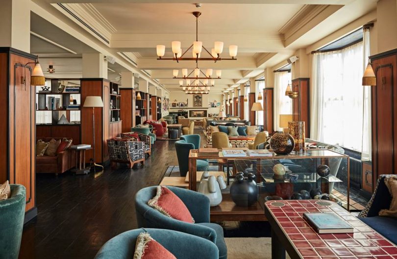
Soho House, a private members’ club for creatives, expanded to Amsterdam this summer. The Soho House Amsterdam establishment has taken over the Bungehuis, an old 1930s university building on the Spuistraat that overlooks the canal, and spruced it up with their signature interiors and furnishings. The building now accommodates 79 bedrooms, a rooftop pool, an entire floor of club space, as well as Italian dining at Cecconi’s restaurant and a Cowshed spa on the ground floor.

And of course, it being located in Amsterdam, there will also be space to park 75 bikes and a workshop for repairs.

The six story high Bungehuis building is a distinct landmark along the Amsterdam canal, with a stark limestone and granite facade contrasted against bronze bay windows. What makes this space even more spectacular is that it is only one of two buildings in Amsterdam with a rooftop pool. If the Dutch aren’t used to lounging on roofs in the sun, this is going to change their game.

If you’re wondering how every Soho House around the world – there are 21 locations total – have a similar vibe, it’s because they have an in-house studio that handles the interior design of the spaces.

A global chain like Soho House is increasingly attractive to digital nomads and creatives. While many freelance workers spend their time in cafes, there’s also been a recent push for subscription-based spaces catered towards digital workers. The benefit is that they know they’ll have an area to work at all day, no pressure to keep on buying coffee or wander from one coffee shop to another every few hours.

To take it a step further, if these digital workers are also global travelers, and they want to avoid working in small, crowded tables or competing for a power outlet especially when they are overseas and need to get work done, Soho House could be the answer.

This year, Soho House has added DUMBO in New York, White City in West London and Little Beach House in Barcelona to their members’ only clubs chain, and they will be expanding to Mumbai and Paris soon after.

It makes sense given the growth of digital workers. According to a forecast by International Data Corporation (IDC), mobile workers will make up nearly three quarters of the total U.S. workforce. That means over 105 million workers in US alone will be mobile, and IDC expects that more than two thirds of them will not be office-based at all.

In Europe too, three quarters of the Western European workforce is said to be mobile this year. This perhaps explains the Soho House expansion into three new European sites to tap into this trend.

For a $2,800 annual fee for membership with ‘every house’ within the Soho House network, you can tap into a global hotel chain that caters to “creative” digital workers. As Soho House builds its brand, it’s realizing that they’ve carved a niche for themselves, giving a comfy space to young, traveling millennials who want tap into a social network and be welcomed into similar social spaces wherever they go.


from Design MilkDesign Milk https://design-milk.com/soho-house-amsterdam-adds-trend-international-chains-catering-digital-nomads/

from Home Improvment http://notelocreesnitu.tumblr.com/post/178544395769

Georg Jensen Solves a Design Mystery More Than a Half a Century Later

Georg Jensen Solves a Design Mystery More Than a Half a Century Later

We’ve been asked to honor non-disclosures and embargoes for a multitude of designs – usually products falling under the realm of technology, automotive, or other products following the ebbs and flows of the consumer market. But several months ago we were asked if we could keep a secret, one made by request and invitation from Danish brand, Georg Jensen. This was something entirely different.

The Copenhagen-based luxury artisan brand would reveal they had been secretly researching and resurrecting a previously lost design, an unrealized sculptural piece by designer Henning Koppel that would see a new life decades later in celebration of his life. It was called the 1041, a name without any real meaning beyond its archival numerical designation.

Nicholas Manville, Senior Vice President of Design and Merchandising at Georg Jensen will do a commendable job of building anticipation about the impending reveal, offering us a tour showcasing the skills of the company’s artisans, silversmiths, and even a resident 3D designer/printer all dutifully working on a myriad of limited edition handcrafted pieces. For those unversed in the history of Georg Jensen, the tour permits a valuable education about the artist-craftsman founder and company history, one documenting Jensen’s inherent fascination of natural forms derived from days spent in the idyllic countryside of his youth, eventually manifesting into a globally eponymous expression of modern silver and hollowware.

The tour will eventually plateau, literally, upstairs in the cozy and object-filled confines of the company’s archives located within an attic where photographs are only permitted from the tightest of angles, lest anyone reveal any geographical indicators of the priceless archive housed within. “Please, no windows in your photos…it could divulge where in the building this archive sits,” says Archivist Ida Heiberg Bøttiger.

Photo: Gregory Han

Surrounded by decades of designs, art, sketches, jewelry and books dedicated to the brand’s storied history beginning in 1904, Bøttiger will rewind us back to 1954 – the date when Georg Jensen’s most famous and important designer Henning Koppel sketched “1041”, an organic expression, more sculptural than functional. Koppel would eventually destroy his abstract piece out of dissatisfaction after a single attempt to turn sketch into object.

99.9% pure silver is crafted into a $150,000 masterpiece. Photo: Gregory Han

The 1041 design was thought to be lost to history, the original sketch languishing forgotten in the Georg Jensen archives until 2016, when it was found again just in time before the Koppel centenary year. It’s discovery, alongside a single photograph of the sculpture made by Koppel before its destruction, would provide the modern artisans at Georg Jensen enough reference to ascertain Koppel’s original intent and realize a bit of “forensic design”.

Still, noting the previous limited resources and capabilities available in 1954, the resurrection of Koppel’s 1041 isn’t a perfect recreation, but rather a studied modern interpretation. 3D software and printing gave the Georg Jensen team tools Koppel could never even dream of decades ago, allowing a level of accuracy previously unavailable in manipulating silver upward and outward. The result is a stunning modernist expression evoking a cellular body in motion (the same technology, the different results, aided in the realizing of an exquisite level of detail across the Georg Jensen and architect Kengo Kuma collaborative tea set).

Ida Heiberg Bøttiger, Product Manager, Silver & Archive Manager at Georg Jensen, carefully shows us the numerical stamp adorning the very 1st Georg Jensen 1041. Photo: Gregory Han

Each 1041 is handled and crafted by a single Georg Jensen silversmith, hand-hammered from a single twelve-kilo sheet of fine silver to a width of 6mm at its thickest center, down to just 2mm at its edges. Silversmith Henrik Förster describes the process as tedious and demanding, but ultimately rewarding. Photo: Gregory Han

The Louisiana Museum of Modern Art would play stage for the reveal of the very first edition of the Georg Jensen 1041 by Henning Koppel, its undulating beauty unveiled amongst an intimate audience in May. Koppel’s own daughter, Hannah Koppel, would join us that afternoon in celebration of her father’s birthday and his body of work (she too is an accomplished Georg Jensen designer and sculptor by her own right), looking proudly upon her father’s past manifested into the present with the exacting level of detail he’d undoubtedly approve of.

Hannah Koppel would invite us to her childhood home which she still lives and works from today, populated by many of her own designs, alongside those designed by her father. Photo: Gregory Han

Photo: Gregory Han


from Design MilkDesign Milk https://design-milk.com/georg-jensen-1041-design-mystery/

from Home Improvment http://notelocreesnitu.tumblr.com/post/178543066019

Coast to Coast Lands in Nashville

Special thanks to Jean Lin of Colony for the following post.

Coast to Coast Lands in Nashville

September kicked off our Coast to Coast series with Design Milk where we, Colony, a NY-based community of independent furniture, lighting, textiles and objects designers, set out to explore the United States in the name of design, discovery and inspiration. Our travel itinerary was set to discover new talent and expressions of American design, art and craft. On the second leg of our tour we visited Nashville, TN, a bastion of southern creativity that contrary to popular assumption, doesn’t start and end with music.

Nate Schiebe’s Nashville woodshop \\ Photo: Colony

Our time in Nashville felt like a treasure hunt, where one great studio visit led to three more friends we had to meet. With a bevy of art schools in close proximity, Nashville is home to a creative community teeming with hometown pride tempered with a fine art sensibility. With just a bit of exploration we were able to uncover a talented community of artists working to grow local industry without losing the city’s artistic roots.

Keep Shop at Noelle \\ Photo: The Callaway

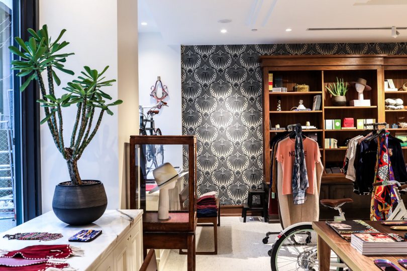
On the lobby level of Noelle, creative consultant Libby Callaway has curated Keep Shop, a luxury retail store that features a mix that’s heavy on local designers and makers, as well as vintage and national brands that are hard (or impossible) to find elsewhere in Nashville. In addition to apparel and jewelry, Keep Shop features home accessories, apothecary, books, independent fashion and design magazines, and a selection of electric Faraday bikes. Exclusive products from local favorites such as natural beauty and wellness shop Lemon Laine, children’s wear brand Arcade Nashville, and local womenswear brand Jamie + The Jones among many others.

An Emily Leonard painting hanging in her home \\ Photo: Colony

Painter and Nashville native Emily Leonard has a gestural style that is rooted in southern landscape, but through a uniquely cultivated layering process impresses ethereal results. Says Emily of her work: “My pieces both take time and contain time. I want them to come upon the viewer as such – slowly and intimately, as if the viewer feels like he found this image instead of me. Iʼm interested in the experience of being in your body in a place.” This sentiment is expressed not only in her paintings but also in her beautifully considered home and studio, where charming and authentic details abound.

Photo: Becky Blevins

The epitome of the proverbial Nashville treasure hunt is Elephant Gallery, both an art gallery and artists studio space and home to all the eccentricities this community has to offer. Watching founder Alex Lockwood tour us through a building filled with both delightful and challenging art was like watching a Nashville kid in a Nashville candy store. Ceramicists Jessica Cheatham of Salt Ceramics and Becky Blevins create many of the noteworthy Nashville ceramic works out of their shared studio space.

Photo: Zeitgeist Gallery

Two Figures out of a Landscape, Vadis Turner, 2018 \\ Photo: Vadis Turner

Photo: Alex Blau

Zeitgeist has been a staple on the Nashville art scene since 1994. Started by Janice Zeitlin in Cummins Station, it has served as a cultivation ground for new artists and a safe place for established artists to experiment and grow. The gallery represents such local artists as Alex Blau, a graphic, layered and bold painter, and multimedia artist Vladis Turner. Through her work, Vadis explores the transformative possibilities of feminist materials. Commodities created for and produced by women are translated into storied abstract paintings and sculptures.

Noelle Hotel \\ Photo: New Hat Projects

Founders Kelly Diehl and Elizabeth Williams of New Hat Projects specialize in custom wallpaper and interior installations. Their practice is rooted in Nashville through and through, with a project and client list that reads like a design listings page of the city. Earlier this year, they launched Collection One, their first foray into wallpaper available by the roll.

Collection One by New Hat Projects \\ Photo: New Hat Projects

JW Marriott Nashville \\ Photo: David Mitchell

Thank you to JW Marriott for making our Nashville trip possible and for providing the team with a beautiful experience in the JW Marriott Nashville hotel. The modern interiors were designed by Stonehill Taylor with a nod towards the city’s industrial past and its southern roots.


from Design MilkDesign Milk https://design-milk.com/coast-to-coast-lands-in-nashville/

from Home Improvment http://notelocreesnitu.tumblr.com/post/178541796444

In California, a Mid-Century Modern Home with a Carefree Spirit

The home of Matt and Jen Monroe and their daughters, Cecily and Eleanor, breathes a fresh, California spirit throughout its mid-century modern walls — a combination that feels both effortless and meticulously planned all at once. Though, truth be told, it’s taken quite some time, work and patience to get it to this point from the moment they laid eyes on the house and saw its potential five years ago.

The 1951 home in Los Angeles, CA’s Eagle Rock area lured the family in with its big windows and private backyard, but the biggest draw for them was the neighborhood itself and great public school nearby for the girls. Matt is a woodworker/furniture designer/toy designer and owner of Monroe Workshop, and Jen is a film producer (her credits include Jackie starring Natalie Portman, The Zookeeper’s Wife starring Jessica Chastain, and Megan Leavey starring Kate Mara). With the two excelling in vastly different creative fields, they’re bound to approach things from different perspectives, and designing this house over the years was a perfect example of that.

“Matt takes a long time to make careful decisions and I make really fast (sometimes bad) decisions just to cross things off my list,” Jen admits. “Luckily we are usually on the same page with design and have really similar taste. Matt will sometimes come up with an idea that I don’t understand — for me I like to see it first in a photo or online or else I’m nervous to commit. For example, I couldn’t really visualize what he had in mind when he wanted to cover our living room walls in big panels of walnut. But we both like natural materials and he was convinced that it would warm up the house in an interesting way and he was right. I need to trust him when he gets excited about design…”

Despite Jen’s tendency to speed through to-dos, she heeded the advice of others to live in the home first before doing the majority of the renovation work. “Before we moved in, we redid the floors and put in the big sliding doors,” she shares. “Everything else happened in spurts over time. We redid the kitchen, enclosed an outdoor laundry area which extended the kitchen, we added on to the master bedroom and raised the ceiling (which makes all the difference), we added a master bathroom, we added an office, we built decks and fences in the backyard… It was a huge job and no room was left untouched. It wasn’t easy living through it all but the end result was worth it.”

Now the 2,000-square-foot home (one level, with 4 bedrooms, 2.5 bathrooms in the main house and a guest house with a bedroom and bathroom) functions as a comfortable and functional house for the family of four — along with their two chickens, Moana and Precious. It’s the perfect spot to come together after work and school and share stories about the day. —Kelli

Photography by Nicki Sebastian / @nickisebastian

Image above: Jen tells us, “We watch TV in the living room and like having the two big couches in there even though they probably take up too much space. Design wise, we would be better off with one couch across from two lounge chairs — but we like being able to spread out and relax… So we chose comfort over design. But the best part of having two similar sized couches is that we can create one of our favorite family events — movie night in ‘the pod.’ We push the couches together and it’s like a huge cozy crib and we all get in for a movie night.”


from Design*Sponge https://www.designsponge.com/2018/09/in-california-a-mid-century-modern-home-with-a-carefree-spirit.html

from Home Improvment http://notelocreesnitu.tumblr.com/post/178541689989

Friday Five with Wendy Goodman

Friday Five with Wendy Goodman

Since the start of her career, Wendy Goodman has covered both the fashion and design scene at noted publications, like Harper’s Bazaar, New York Times Magazine, House and Garden, and most recently at New York magazine as their Design Editor since 2007. She’s appeared on countless televisions shows including NBC’s Open House, Good Morning America, Ellen’s Design Challenge, The Insider, NY1, and WNYC, along with hosting various design talks around NYC. Goodman is noted for recognizing trends and finding up-and-coming talent, as well as documenting some of the most memorable homes of design lovers around the world. Those decades spent collecting stories on the private homes she’s ventured inside have led to her just released book, May I Come In?: Discovering the World in Other People’s Houses, where she shares 70 of them. And for those not familiar with this notable New Yorker, check out her popular Instagram feed for a closer look inside her visual world. In the meantime, read on to see what she’s picked as some of her favorite places around NYC in this Friday Five.

Photo by Brett Beyer

1. THE METROPOLITAN MUSEUM OF ART
The minute I climb the steps and enter the great hall I feel better, and no matter what show I am visiting I stop in to see my old friends in the Egyptian galleries.

Photo by Colleen Callery

2. THE STRAND BOOKSTORE
The Strand is my favorite bookstore in the world, and one of the greatest spots in New York City. May The Strand live forever.

Photo courtesy of Office AO Architecture

3. COS
I love the clothes and the leather goods at COS, and I WISH their oxford shoes fit me as I would never wear anything else, ever, but, alas, I am STILL searching for the perfect oxford.

Photo courtesy of Sant Ambroeus

4. SANT AMBROSEUS
The one on Madison Avenue, standing at the bar, having an iced cappuccino, is my idea of heaven.

Photo by Iñaki Vinaixa

5. LINCOLN CENTER
If I could rent a cot and live in the theaters during ballet season, I would.


from Design MilkDesign Milk https://design-milk.com/friday-five-with-wendy-goodman/

from Home Improvment http://notelocreesnitu.tumblr.com/post/178540620069

Get Inspired This Weekend at the Affordable Art Fair NYC

It’s that time of year again! When autumn rolls around, the familiar signs of the season return — falling leaves, cool mornings and one of our favorite art events filled with original work from independent artists. This weekend the Affordable Art Fair NYC opens to the public and we couldn’t be more excited! This year’s fair began yesterday and runs through September 30th at the Metropolitan Pavilion located at 125 W 18th St. You can get tickets here.

The very first edition of the Affordable Art Fair launched in London’s Battersea Park back in October 1999 and 10,000 art lovers descended upon the fair. The relaxed and no-pressure environment provided the perfect weekend for visitors to browse and purchase thousands of original contemporary paintings, sculptures, photographs and prints. After the original fair’s success, it became a reoccurring event and now the Affordable Art Fairs across the world welcome over 210,000 art enthusiasts each year. Visitors can enjoy a mix of local, national and international galleries showcasing a wide array of art by established artists and rising stars.

Beyond the comfortable gallery atmosphere, the fairs also host a creative smorgasbord of artist performances, innovative talks and tours, hands-on workshops, kid’s activities, live music and irresistible restaurants and bars. The fairs make for an ideal day out with family and friends. If you’re in NYC this weekend, visit the fair and get energized by the art and atmosphere. If you’re outside the city, take this opportunity to visit the site online, get inspired and maybe even plan a trip to the city around the celebration next year.

This post is is a collaboration between Design*Sponge and the Affordable Art Fair NYC. We encourage you to support independent artists and designers and this long-running event that brings original artwork to the public. Enjoy a preview of the art and event right here.

Today we’re sharing some of our favorites from this weekend’s fair!

Image above: Yvonne Michiels, ‘Fading Flowers Red’, 2017, Photo composition on diasec, Edition of 9, 43 x 43in, Villa del Arte Galleries, Stand 1.30.

Image above: Iona Stern, ‘Heat Haze’, 2018, Monotype, screen print and paint, 24 x 24in, Fine Art Consultancy London & Tokyo, Stand 1.41.

Image above: Jayoung Yoon, ‘Emptiness of Form 02’, 2018, Photopolymer on BFK rice paper, 11 x 15in, Julio Valdez Project Space, Stand 1.54.

Image above: David Farren, ‘Blue Reflections towards Times Square’, 2017, Oil and acrylic, 24 x 24in, $2,500, Signet Contemporary, Stand 1.21.

Image above: Laura Park, ‘Come Fly With Me’, 2018, Acrylic on canvas, 48 x 48in, Muriel Guépin gallery, Stand 1.2.

Image above: Adam Bridgland, ‘I Need This Wilderness For My Heart To Beat (NYC)’, 2018, Screen print on Somerset Tub Sized 410 gsm with hand spray paint overlays, Limited Edition of 10, 27.6 x 19.7 in, Unframed, TAG Fine Arts, Stand 1.11


from Design*Sponge https://www.designsponge.com/2018/09/get-inspired-this-weekend-at-the-affordable-art-fair-nyc.html

from Home Improvment http://notelocreesnitu.tumblr.com/post/178540527919