Friday, 3 August 2018

Friday Five with Matt Wade

Friday Five with Matt Wade

Designer Matt Wade is the Global Principal of Experimental Design at creative company, Moving Brands, a place he worked previously as a design director from 2004 to 2008. During his 10 years away, Wade co-founded London-based research and design studio, Kin, with Kevin Palmer, working on projects for YouTube, Nike, NASA’s Jet Propulsion Lab, Microsoft, LGBT Center New York, London Science Museum, and the Maritime Museum. He also served as director of the Google Creative Lab. His decade away prepped him for a move to New York to re-join Moving Brands where he focuses on three key aspects: using technology to develop interactive living spaces, creating experiences for new technology platforms like mixed reality and augmented reality, and leading the Gobi team that utilizes prototyping to define future products and services. Read on and you can get a glimpse of some of his likes and sources of inspiration in this Friday Five.

1. Code as material
I like to think I’m a maker and wanted to be a product designer when I was a student, but I was never as good at making as the other people on my course. I found this frustrating so relied a little on my visual sensibilities to succeed. I ended up making a lot of graphic objects that explored the way people use things – sort of design systems for objects. After leaving University my first job was as a multimedia designer – back in the day of CD-ROMs.

The team was made up of designers, animators, producers, and coders. The coders were by far the most interesting to me, they were the closest thing to makers in that team. I hung out with them more than anyone else and taught myself how to code (badly). Several years later I did a Masters in Architecture and Computation, and learnt to code properly, C++ etc. But when I was introduced to a new, unreleased software language from MIT called ‘Processing’ my world lit up. It was amazing, so accessible, built for people like me. Makers. This was 14 years ago and I still use it today – to sketch ideas, to prototype interactions, to make tools.

2. The street
I’m fascinated with the changing textures of the city and the relationship between intent – as controlled by an architect, landscaper, or urban planner, as well as the on-going maintenance from the people who keep city in working order, such as local council and government workers. I have an Instagram account called pattern.languish that documents some of these observations. I’m especially interested in how the updates, fixes, and repairs create scars and marks that expose the interactions between the city and the people who care for it.

3. Victor Papanek
I was introduced to the writing and Teaching of Papanek when I went to University – he opened my eyes to so many things and it went deep. He’s my imaginary mentor – I often think, ‘what would Victor Papanek say or do?’ There are many definitions of design, his is the one that resonates with me the most: “Design is the conscious effort to impose a meaningful order.”

4. London
I live in New York, but I miss London. I lived there for 20 years before I came to the States. I arrived for University and feel like it’s where I grew up. A lot of my sensibilities come from London. It shaped who I am. I used to walk a lot – a lot more that I walk here. I was obsessed with Taxi Drivers. I used to go to a cabbie’s cafe every day and try and blend in. I even started to learn the knowledge. I was lucky enough to work with Transport for London and the London Transport Museum before I left.

5. Deadliest Catch
I don’t watch much TV as I have a short attention span, but I love Deadliest Catch. Always have. I’m the first male on my mum’s side of the family not to work on the docks for a few generations and I think it must be some sort of longing for a real job, something honest, instead of mucking about with design in a comfy studio, surrounded by all the gadgets and materials any reasonable person could wish for.

I spotted someone wearing a “CREW’ jacket in my neighborhood this weekend and I was so jealous. I would honestly give it all up tomorrow to go and work as one of the crew on the show… (I’m much too comfy to actually want to be a fisherman!).

Photos by Matt Wade.


from Design MilkDesign Milk https://design-milk.com/friday-five-with-matt-wade/

from Home Improvment http://notelocreesnitu.tumblr.com/post/176587692644

5 Ideas for Fold-Away Kitchen Storage

If there’s one thing many of us feel we need, it’s more kitchen storage space. It seems like there’s always some new doodad to buy for the kitchen. And putting it all somewhere can get to be a challenge. But that’s why they invented fold-away kitchen storage.

These design elements are defined by how they can fold or roll in some way to create more storage without visibly taking up more space. It’s practically like having a storage area bigger on the inside than the outside. Below are some ideas for making the most of fold-away storage in the kitchen.

Fold-Away Kitchen Cabinets

Spices and cooking pans are great items to store in expandable cabinets. Image: Matt Lehn Construction

Expandable Cabinets

A popular idea for fold-away kitchen storage is cabinets that pull out instead of swinging open. This often gives an increased amount of storage, since you can use the whole space under the counter more easily.

Traditional shelving in cabinets has a primary problem. What usually ends up happening is that you use the front part of the space because that’s the easiest to access. Then, if you do use the back part of the cabinet space, you end up with items in the back of the cupboard that don’t get used because you forget they’re there. With a roll-out system, you can see clearly in the light of day what you have in your cabinets.

Fold-Away Kitchen Storage Hidden Workstation

A workstation can mean a sleek design when you are not cooking or serving. Image: Plain English Cupboardmakers

Workstation Cupboard

This cabinet space makes great use of multiple levels of shelving and a small workstation counter space. But the best part of the design is the slide-out drawers. These allow you to see what you have stored. The fact that you can slide out the drawers means you don’t have to take up the area with bulky shelving that requires more vertical space.

The sliding drawers also allow the door to swing shut more easily. What you’re left with is sleek, hidden storage when the space is not in use. The shelving on the doors is also a nice touch for some added spice storage.

Fold-Away Kitchen Storage Microwave Area

Keep your appliances hidden in a microwave nook. Image: Charlie Kingham

Cupboard/Microwave Nook

One of the ways to maximize the benefits of added storage is to get multifunctional with your storage space. This fold-out cabinetry makes room for a small microwave. It’s also a wonderful design idea since it allows you to hide the microwave when not in use. If you’re going for a sleek, bright and modern kitchen like the one in the photo, you’ll want to hide as many bulky appliances as possible. It makes for a cleaner aesthetic.

This design also makes great use of added shelving on the fold-out doors themselves. When looking at fold-away kitchen storage, ideally no space should go unused. In the same vein, shelving is also well placed around the microwave itself.

Fold-Away Kitchen Storage Hidden Appliance Nook

Save counter space with hidden outlets for plugging in appliances. Image: The French Tradition Fine Custom Cabinetry

All-in-One Space for Fold-Away Kitchen Storage

Here’s another fine example of fold-away kitchen storage. It takes the design above and expands upon it. You have space for a small microwave, but there is also space for other appliances like the toaster. There are even outlets to plug it all in. And the shelving is high enough to get in and use the toaster right in that space. As a result, rather than serving as pure storage, this space also makes a highly functional workstation.

Meanwhile, plenty of pull-out shelving means tons of storage options that don’t take up too much space vertically. Shelving of various heights on the doors makes it a good space for storing a variety of items.

Fold-Away Kitchen Storage Expandable Table

Meet the murphy bed of tables. Image: Osborne Architects

Fold-Out Table

Whether you have a small kitchen space or a large one, a fold-out table can help add extra floor space. It’s out when you need to eat and away when you don’t. Gone are the days of trying to find a place for the kitchen table or stepping around one.

One bonus is that you are folding the table away when you are done eating. So it’s not one more flat space for you to throw your items onto and leave. The fold-away nature of the space can encourage you to keep your kitchen table from accumulating months’ worth of junk.

The post 5 Ideas for Fold-Away Kitchen Storage appeared first on Freshome.com.


from Freshome.com - Interior Design & Architecture Magazine https://freshome.com/fold-away-kitchen-storage/

from Home Improvment http://notelocreesnitu.tumblr.com/post/176586597534

Thursday, 2 August 2018

West Elm and Steelcase Partner for Better Workspaces

steelcase & west elm

West Elm and Steelcase have announced a partnership to develop new kinds of workspaces. Image: Steelcase

We hope you like the products we recommend. Just so you are aware, Freshome may collect a share of sales from the links on this page.

West Elm has long been a go-to choice for anyone who prefers a modern aesthetic. You can find its furniture and textiles in homes across the country. But it isn’t settling for making its mark on the residential domain. It’s now pushing into the commercial space through a new partnership with Steelcase.

Steelcase has helped companies build highly functional, highly beautiful offices for over a century. It got its start as a manufacturer of metal office furniture. Today, it has expanded its offerings to include a wide portfolio of architecture, furniture and technologyproducts and services. And it does all of this with sustainability in mind.

As two prominent leaders in their respective fields, a partnership between West Elm and Steelcase makes sense. Through it, they hope to help the modern workplace make some sense, too. No more lifeless cubicles and austere seas of desks. By working together, these two partners can lean on Steelcase’s knowledge of building quality office spaces while incorporating West Elm’s residential feel. The result is workplaces that feel less like prisons and more like homes.

west elm workspace

West Elm has a few years’ experience in working with contract-grade office furniture. Image: West Elm Workspace

West Elm and Steelcase team up for well-being in the workplace

West Elm has been developing contract-grade office furniture since 2015, and it’s seen growth in this area ever since. The company attributes that growth to “commitment to three key values that inform [its] designs: well-being, residential inspiration and choice.” Who wouldn’t want to work in an office that keeps your mental health and comfort at the forefront? According to both companies, that’s the whole point of this collaboration.

“Steelcase and West Elm share an ethos of improving the physical, cognitive and emotional well-being of people at work,” says Allan Smith, Steelcase’s VP of Global Marketing. “Together, we aspire to help organizations create inspiring, high-performance workplaces where people can be highly engaged and do their best work.”

west elm workspace 2

West Elm’s office furniture brings a comfortable, inviting feel to the workplace. Image: West Elm Workspace

The office of the future

The modern workplace has been changing for years. Companies have hunted for ways to maximize their square footage while creating spaces that attract top talent and motivate them to do their best work. At the same time, today’s workforce has been demanding greater flexibility. Across the country, companies have been swapping cubicles for open floor plans and conference tables for ping pong tables. Today’s office furniture can’t just be functional; it needs to also be fun, comfortable and versatile.

It makes sense, then, for a leader in office design (like Steelcase) to look to a leader in home decor (like West Elm). By mirroring what we love about our homes in our workplaces, we might just fall in love with where we work, too. And employees who like where they work are more likely to show up on time, be creatively stimulated and stay in their positions long-term. In short, investing in the products of this new Steelcase and West Elm partnership could help companies keep turnover down and build their best teams.

west elm

West Elm and Steelcase are working to make offices feel more like home. Image: Steelcase

If you want to learn more about the product line that will be available as a result of this partnership, you can sign up here. Steelcase is promising more information this summer.

What do you think? Would you be drawn to work for a company because it had an attractive, flexible office?

The post West Elm and Steelcase Partner for Better Workspaces appeared first on Freshome.com.


from Freshome.com - Interior Design & Architecture Magazine https://freshome.com/west-elm-steelcase-workspaces/

from Home Improvment http://notelocreesnitu.tumblr.com/post/176565062314

A Modern, Folding Sofa Made from Two Belts, a Frame, and a Cushion

A Modern, Folding Sofa Made from Two Belts, a Frame, and a Cushion

When you have a compact living space or you live in a rental, smaller, easy-to-transport furniture is essential. Knowing you’re moving again in six months and you have a massive sofa that weighs enough to require 3-4 people to move it, can be stressful and expensive. Kunikazu Hamanishi, of Hamanishi DESIGN, designed Blanco as a smarter alternative. The two-seater folding sofa easily comes together with a simple tubular frame, cushion, and two leather belts that result in a comfortable, stylish sit.

The Blanco comes flat-packed, which means you can also take it apart when the time comes to move. It assembles in a matter of minutes with its cushion attaching to the X-shaped frame with the help of rods. After it’s secured, the belts tighten and help keep the frame’s shape while also adding a distinct design element.

Photography by Ryoukan Abe.


from Design MilkDesign Milk https://design-milk.com/a-modern-folding-sofa-made-from-two-belts-a-frame-and-a-cushion/

from Home Improvment http://notelocreesnitu.tumblr.com/post/176561740649

ARTLAND IN SHANGHAI: An Eclectic Apartment That Goes Outside the Box

ARTLAND IN SHANGHAI: An Eclectic Apartment That Goes Outside the Box

ARTLAND IN SHANGHAI is a project that came about through the Chinese renovation TV show, Change your life, which brought on TOPOS DESIGN CLANS to renovate this rental apartment for a family of four. The 80-square-meter (approx. 861-square-feet) apartment is located in a high-rise building in Shanghai and the designers wanted to create a space that reflected a “realistic utopia” to help encourage a new, creative lifestyle.

The occupants are a painter, his wife, and two shepherd dogs now living in a unique home that also doubles as an art studio for dad. In their previous rental, art supplies and artwork crept into every corner of unoccupied space creating chaos and disorganization with no real space for life or art to happen. Both adults got their wishes to have a cohesive living space with an open art studio to achieve ultimate family happiness.

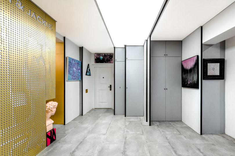
The open living room is now ready for life and art, using black and white as the main colors to act as a backdrop, or three-dimensional canvas, for life to add the color. A black-painted corner holds tubes of paint and palettes on the wall to look like art. Beside that is a gold pixelated display that was created from a photo of the couple’s dogs.

A partition wall slides to offer privacy while doubling as a display wall for paintings.

A pegboard wall can be changed up to display things or store stuff.

Storage cabinets hide art supplies out of the way.

The couple’s beloved dogs get their own home in a golden kennel. The surrounding golden surfaces become gallery walls to display art.

A niche is the perfect spot for keys and dog leashes.

The three private rooms, the bedroom, kitchen, and bathroom, were given special, colorful attention.

Before photos

Photography by CreatAR Images (AI Qing, WU Jianquan).


from Design MilkDesign Milk https://design-milk.com/artland-in-shanghai-an-eclectic-apartment-that-goes-outside-the-box/

from Home Improvment http://notelocreesnitu.tumblr.com/post/176558596314

5 Ways to Work With Colorful Grout

Designers are always looking for ways to incorporate color into spaces. And for a good reason: Shots of bright color add visual interest and a playful feel to any room. One new way people are using color is with colorful grout.

Once simply a way to seal the spacing between tiles, grout is taking on a fashion sense all its own. By dyeing the actual grout bright colors like teal, yellow and pink, a tile design can have a fun accent color that adds some artistic flair to a space. Read on to learn how to work with the new design trend of colorful grout.

Colorful Grout Yellow Bathroom

Yellow grout adds a cheery pop to any space. Image: MRTN Architects

Match the grout to other walls

In order to ensure that your new colorful grout doesn’t go unnoticed, you can match the grout color to other accent walls, like in the photo above. Doing so adds cohesion to the space. And since an accent wall puts people in the mindset of that color, the grout pops all the more.

To get this effect, you can either paint a traditional accent wall or use an adjoining wall with tiles that match the grout color. The room in the photo above elected for both options, so don’t feel limited to just one style here. You can even paint a door or have cabinetry that matches the grout color.

Colorful Grout Pink Kitchen Space

Pink grout adds a fun, feminine look to this kitchen. Image: Andrew M. Boyd Photography

Use bright grout against light shades

A common way to make bright grout pop is to use it against white tiles. That way, the light tiles don’t compete with the grout; the grout truly becomes the star of the show. For added effect, extend that light color scheme beyond tiles. For instance, in the photo above, the light tiles match a white wall and white counter space and allow the pink grout to shine.

Colorful Grout Contrast Bathroom

Bright yellow grout stands out as part of a contrasting style. Image: Oliver Burns

Create contrast between the grout and tiles

Another option is to use contrast to make the colorful grout more noticeable. For instance, the design above combines a bright yellow grout with a light blue tile. The yellow against the cool tile color makes it somewhat of a statement look. A bolder look involves using bright grout against dark tile or dark grout against light tile. Regardless of which color combination you choose, the contrast helps the colorful grout stand out.

Colorful Grout Teal Kitchen

Neon teal invokes electricity. Image: Adie Courtney Architect

Use colorful grout in places that are easy to see

Since grout itself sits in thin lines between tiles, place it where it’s easy to notice: around bathroom mirrors, over kitchen sinks, or behind cooktops. Placing bright colors like neon in high-traffic areas naturally draws the eye to otherwise-small details.

If you really want to make people notice your bold design choice, try opting for colorful grout between smaller tiles on the floor. It pulls focus to an area that doesn’t often get attention — the floor — while creating a unique visual treat.

Colorful Grout Gold Bathroom

Metallics aren’t just for fixtures anymore. Image: Tile Mountain

Try metallics

When choosing your colorful grout, don’t feel limited to standard paint colors. The shiny gold grout in the photo above demonstrates how well metallic shades work in a bathroom. This style stands out when matching the grout to bathroom fixtures.

To make the metallic grout pop, aim for a light or muted shade of tile. Metallic grout doesn’t have the colorful intensity of the other neon shades above, so it needs to be paired with shades that won’t compete for visual attention.

With so many shades of colorful grout out there, and so many ways of incorporating it, options are endless. Will you pair dark grout with light tile? Neon grout with dark tile? Metallic grout with floor tile? However you’d like to use colorful grout, we’d love to hear about it below.

The post 5 Ways to Work With Colorful Grout appeared first on Freshome.com.


from Freshome.com - Interior Design & Architecture Magazine https://freshome.com/colorful-grout/

from Home Improvment http://notelocreesnitu.tumblr.com/post/176558578324